Styli Fashion
A fast fashion e-commerce platform by Landmark Group
Website: https://stylishop.com/
Featured on DesignRush: The Best E-Commerce and Retail App Designs
Project duration: OCT, 2019 - AUG, 2020
Website: https://stylishop.com/
Featured on DesignRush: The Best E-Commerce and Retail App Designs
Project duration: OCT, 2019 - AUG, 2020
STYLI wants to be the voice of Arabic fast fashion culture, primarily serving countries like Saudi Arabia, Kuwait, Bahrain, UAE etc. With localized shopping app, warehouses in Riyadh and Arabic first customer support, Styli aims to capture an experience that resonates with the GCC fashionistas. It is the first online-only venture by Landmark Group, which is the largest retail and hospitality organization in the MENA region.
Team: Nikhil Singh, Mohammed Sharafeldin Hamed Aly Sedky and Rahul Rawat.
My Role: Led the project as Sr UX Designer, owned design sprints on Jira and helped in product planning.

Compared to global standards, GCC(Gulf Cooperation Council) consumers are “underserved” on online offerings, especially on product and service quality. Several gaps in the consumer proposition of existing players have led to a fragmented market which leaves a room for a new player. Growth here is driven by very high internet penetration and young, digitally engaged demographic. Online spend by this demographic is significantly high (Ex: Avg online monthly spend in UAE: 1400-1600 AED, in Saudi Arabia: 900-1100 SAR)
And with the Landmark group's capabilities in this region, STYLI stands to benefit massively from it in targeted customer marketing, product sourcing, supply chain and partner ecosystem. Becoming a dominant player in this market also implies a strong foothold in the MENA region.
With an MVP already launched, I joined the firm in Oct 2019 and outlined the following design goals to further our efforts.
- Analyze online customer behaviour through qualitative and quantitative research.
- Conduct a design audit to highlight the UX flaws & UI consistency issues in the product.
- Create a design system to revamp the experience of the consumer app. Use this design system to build our internal platform for visual merchandising and inventory management.
- Set up usability testing and data analytics tools to iterate the product(Contentsquare, UserZoom, Hotjar etc.).


We conducted a design audit exercise to identify potential usability issues in the current MVP based on standard e-commerce practices. The visual experience felt fragmented as many design elements were inconsistent with each other.
This compelled us to build a design system that would extend to our internal products as well.
VIEW FULL AUDIT REPORT HERE
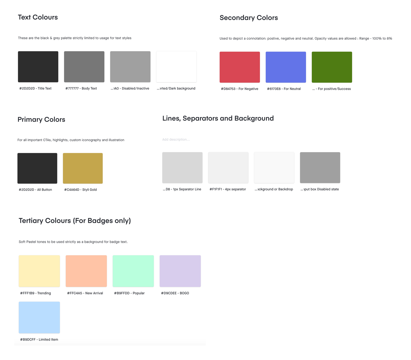
• Consistent UI
• Accessibility(AA standard)
• Arabic language support
• Categories -> Listing page -> details page.
• Structure category levels as L1, L2, L3 and L4.
• Merchandising + Forward flow through Tagalys.
• Highlight discount & savings
• Introduce product badges - trending, popular etc
• Dark patterns: “only 2 left in stock”(Scarcity) or “14 people viewed this” (Social validation)
• Bag -> Address page -> Payment
• Show checkout progress
• Integrate maps to capture address. GCC doesn't use pincode
• Integrate Apple Pay & Tabby for payment
• Create post-purchase experience: Track active orders, Manage returns, Order history.
• Edge cases like failed payments, incomplete transactions and failed deliveries.
• Integrate the Shukran loyality program of Landmark group to Styli.
• Use credits as rewards for customers and for managing faster refunds

• Categories: L1(Men, Women), L2(Clothing, Accessories)
• Product Listing Page: PLP-L2, PLP-L3
• Filter and sort function
• Keyword search, Notifications

• Product details, SKU ID
• View size options and delivery estimate
• Colour options, model information
• Return policy and similar recommendations

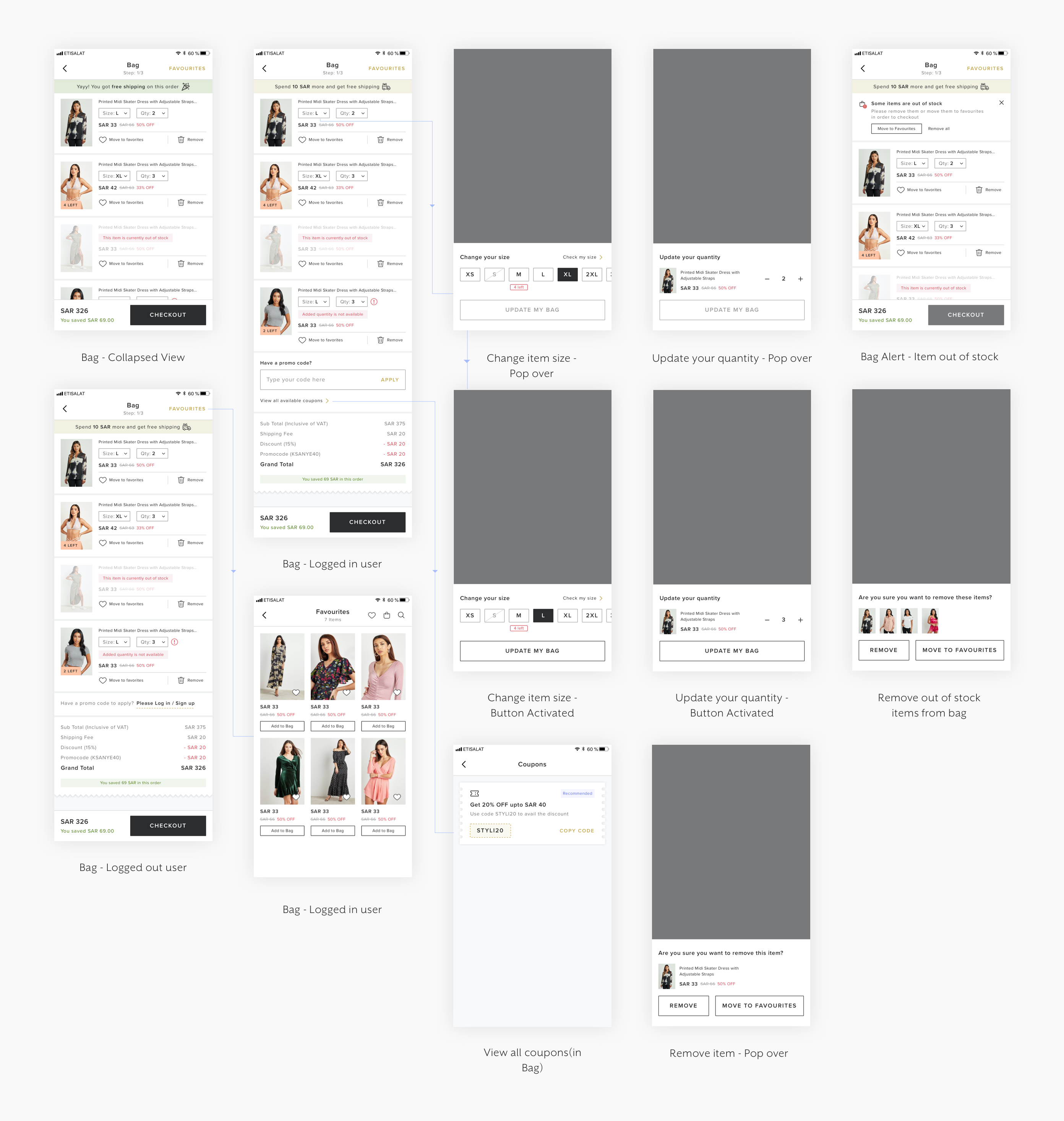
• Bag with edge cases like out of stock, low inventory alert
• Sign up or Login. Option for guest checkout too
• Address page
• List based selection for province, city as GCC does not have pin code system


• Different Payment options along with Styli Credits
• Thank you page, Confirmation screen

• Edge cases - Item return to origin, Delivery rescheduling
• Return eligible items and the flow


(A) We noticed a significant customer dropoff in PDP to Bag funnel. Researchers found that customers lacked purchase confidence due to size issues. Also, they felt the return-refund process is cumbersome.
- Solution: Integrate the FITFINDER to recommend the size to a customer. Bring customer ratings & reviews with polling on three options: "True to size", "Small" and "Large".
(C) Product listings to Filters page has a significant user dropoff. How do we encourage product discovery using filters?
- Solution: Add open filter modals or snippets on the listing page. Their increased visibility would increase their usage.
(E) Growth hack#1: Add to bag directly from the product listing page, hence skipping the details page and uplifting funnel conversion.
(B) A high volume of Cash on Delivery orders is creating a negative impact on business, especially with refunds and last-minute cancellations.
- Solution: Prepaid salience - Bank offers on credit/debit card, integrate Aramex pay/Tabby(pay later), and charges an extra fee for COD(adds friction).
(D) First-time users drop off during the login/signup process of checkout. How might we create a frictionless checkout experience while also registering them?
- Solution: Use the email and phone number from shipping details while they check out and create a temp account. Nudge them to create a password on the order confirmation page instead.
(F) Growth hack#2: Abandoned cart strip on the home page. Use "scarcity tactic" to nudge them for checkout.
Although users have a very fixed mental model for e-commerce, localization of product and services for a market is necessary for long term success. Styli Fashion achieved a market share by being an Arabic first e-commerce platform.
A "try before you buy" model can help e-commerce businesses save cost by charging users a small annual fee. Free return services leads to margin leakage if the return volume is high. But they are essential to boost customer purchase confidence and offer a seamless experience.
Invest in visual merchandising(strategy, internal tools) to create truly immersive shopping experiences online. It's essential for online metrics such as engagement, time on site and compared to physical retailers, online stores can easily tailor the shopping experience to different user types.